
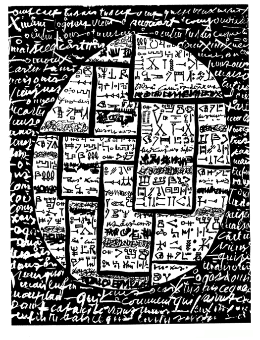
Tim Gaze, 100 Scenes, A graphic Novel. 2013.
read it at Google Books
View some sample pages here
“...an open novel, for you to project your mind into. Every page is a stimulating field for your imagination...”
The images are raw scans of original pages made using cheap acrylic paint on sheets of ordinary office paper. The pages were made over a period of 4 or 5 years. It took a few weeks to select which hundred to assemble into this book, and a few more weeks to decide on which order to put the pages.
Most of the marks were made using a technique known as decalcomania. You spread ink or paint on a surface, then print off that surface, which results in chaotic, organic, blotty shapes. The Surrealist artist Oscar Domínguez invented this technique in 1936. Max Ernst made several paintings which used decalcomania along with other techniques.
Among other places, Tim Gaze is proud of the work published in Abstract Comics: The Anthology, VLAK 1, noology & 100 Scenes. He lives in the Adelaide Hills of South Australia.
“Nobody has attempted a whole novel in this style before!”
One of my favorite poetry paradoxes is how reader-response can be most enjoyable when what’s being read doesn’t posit a fixed meaning or literally does not make sense. As such, I hold a special affection for Tim Gaze who first introduced me to asemic writings. As Wikipedia notes (and do click on excerpt below for more info):
The word asemic means "having no specific semantic content".[1] With the nonspecificity of asemic writing there comes a vacuum of meaning which is left for the reader to fill in and interpret. All of this is similar to the way one would deduce meaning from an abstract work of art.Well, now, Gaze has released a novel entitled 100 Scenes, a tale that unfolds through a hundred abstract “scenes” such as the examples below. Gaze says in the Notes section that the images touch “upon two emerging areas: abstract comics (known in French as bandes dessinées abstraites, or bds abstraites) and asemic writing. These areas transcend languages, and offer the possibility of inter-cultural communication without words.”
The images themselves were created, as Gaze explains, as follows:
The images are raw scans of original pages made by me, using cheap acrylic paint on sheets of ordinary office paper. The pages were made over a period of 4 or 5 years. It took a few weeks to select which hundred to assemble into this book, and a few more weeks to decide on which order to put the pages. One page has a conspicuous black line on the right hand side, which I left there.
Most of the marks were made using a technique known as decalcomania. You spread ink or paint on a surface, then print off that surface, which results in chaotic, organic, blotty shapes. The Surrealist artist Oscar Domínguez invented this technique in 1936. Max Ernst made several paintings which used decalcomania along with other techniques. One example is Landscape with Lake and Chimeras (ca. 1940).
100 Scenes may well be the first whole novel (whole novel versus sections of novels) written in this manner, or at least Gaze can’t recall another such novel written in this style. Gaze's recollection matters as he's somewhat of an expert in the area. As a result, one of the book’s strengths is the very useful Notes section that goes into a history of influences and/or historical references ranging over Max Ernst’s collage novels, The Giant's Fence by Michael Jacobson which is a novella full of symbols invented by the author, abstract short stories by Rosaire Appel, Nautilus by Andrei Molotiu which is a series of abstract comics sequences, the science fiction novel Golem100 [I don’t know how to do it on Blogger but that’s Golem to the power of 100] by Alfred Bester which contains graphic sequences among conventional chapters, other novels like Peter Handke’s The Goalie's Anxiety at the Penalty Kick (English translation of Die Angst des Tormanns beim Elfmeter) and Claude Simon’s The Battle of Pharsalus (English translation of La Bataille de Pharsale) which both contain a page or two that incorporates pictogrammes among paragraphs of words, Donald Barthelme's short stories The Flight of Pigeons from the Palace and At the Tolstoy Museum that utilize pictures as a basis for stories, the French avant-garde group known as the Lettristes (in English, "Lettrists" or "Letterists") who invented the hypergraphic novel (a novel which uses letters, symbols and images) and especially Alain Satié's Ecrit en prose (PSI, 1971) which Gaze considers “the most open-ended, and closest in idea to myown,” Henri Michaux’s works of hand-drawn symbols, the first edition of Laurence Sterne's classic experimental novel Tristram Shandy (Volume 3, 1761) which includes a single page of an abstract marbling design (examples can be seen at http://www.tristramshandyweb.it/sezioni/sterne/biography/
sterne_portraits/marblepage_gallery/index.htm) that could be interpreted to represent Tristram's state of mind and Victor Hugo who used to use inkblots as a “starting point” for his illustrations. As I said, the Notes are a good addition to the book.
And the Notes also provide a girding of sorts because the actual hundred scenes in Gaze’s novel will require proactivity from the reader. It is the reader who ultimately will create some story which Gaze’s scenes create but in a non-fixed form so that different readers can create different stories.
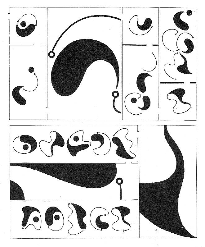
For example, here are Pages 7 and 8 from 100 Scenes:


Now, one can certainly do ekphrastic readings on the individual images. But key to reading them is also paying attention to the procession of images. So, for example, the first image above could be—lesseeee, well, it could be—an excerpt, I mean, a portion of a tree’s canopy. And then the second image could be part of a flock of birds winging away. When you combine the two images, it’s quite clear (ahem) that the novel’s protagonist (if such be the bearer of the gaze) was looking up towards the sky. With just such facets, layers of a story can be implied. Perhaps the gaze-bearer was a bird hunter, say…
… who, because of other images elsewhere in the book, was having an affair set in Italy and the couple managed to take a weekend off to go to Russia and continue their affair in some wooded area and the guy was taking a hunting break and then accidentally shoots the person he’s having an affair with and now must bury the body somewhere in the forest….and so on and so on. (I’ma jest sayin’, you know what I mean…?)
In conclusion, I recommend this book because it provides a good narrative. But you’ll need to read the novel as you might more effectively read a poem: you've got to invest yourself within its lines.
- Eileen Tabios
Comics writer and historian Alfredo Castelli said that, even if, for the best of his knowledge, the first newspaper Sunday Comic Section in the U.S.A. to regularly adopt the title “Comics” in short was published by the St Louis Globe Democrat in 1902, the word “comics” was well established to refer to the art form by the 1910s only. I don’t know who, at the turn of the 19th to the 20th century (I suppose) first applied the already existing word “comics” to fulfil this new function…
On the other hand German art historian Wilhelm Worringer used the already existing word “abstraction” to apply it to the visual arts in the title of his book Abstraktion und Einfühlung (Abstraction and Empathy), published in 1908. The concept predated the actual invention of abstract high art by some Russian painter (probably Wassily Kandinsky, but Mikhail Larionov is also a possibility – and how about Kasimir Malevich and Czech painter František Kupka?).
I’m saying the above because I joined the two concepts and coined the expression “abstract comics” (I wouldn’t be surprised if someone in the below comments proves me wrong though…). Andrei Molotiu reminisces:
I first began thinking of abstract comics as a concrete possibility during a discussion with Domingos Isabelinho on the TCJ board in the summer of 2002, on a thread with the rather awkward title, “Is there a Hemingway or Faulkner of comics?”– or something of the kind.I don’t remember any of this to tell you the truth. In fact, I didn’t pay any attention to my “discovery” (so much so that I saved a few TCJ‘s messboard threads, but not this one). Abstract art was, to me, such a natural thing that I mentioned abstract comics without giving it a second thought. Here’s the only thing that I remember (or misremember, but I hope not…): at some point in the thread the two possible readings of a comics page came about. It’s possible that I mentioned French comics scholar Pierre-Fresnault Deruelle and “his” theory of the linear (a vectorial succession of panels – what I call “a reading”) and the tabular (the page as a random visual whole – what I call “roaming”). (I didn’t know it at the time, but said analysis is not by Deruelle who published it in 1976. Said theory’s author is Gérard Genette who published it in 1972 – he called the former a “successive or diachronic reading” and the latter a “global and synchronic look[.]“) to illustrate these two readings I posted the image below by Lettrist writer, filmmaker and draftsman, Isidore Isou:
Isidore Isou, 1964.
I said at the time that the page could be read/viewed in two ways: (1) as a drawing (the global look), (2) as an abstract comic (the successive reading). (I don’t remember my exact words back then, but I don’t want to imply now that the former isn’t part of a comics reading proper.) Anyway, this took too much space already and, in the doubtful chance that you, dear readers, are still interested, too much of your patience and time. Sorry for the self-indulgence!…Contrariwise to what happened with Wilhelm Worringer the expression “abstract comics” didn’t predate abstract comics. Looking back we may found many examples in other fields. The one below is by Portuguese visual poet Abílio:
“Humor” by Abílio, 1972.
My favorite example comes from the comics field though. I mean the following example from Cuba:
The Amorphous and Disheartening of Vacuous Dialog by Chago Armada, 1968.
One of the roots of abstract art is Symbolism, the Gauguin inspired Nabis especially as we can see below:
The Talisman, the Aven River at the Bois d’Amour by Paul Sérusier, 1888.
It was fellow Sérusier Nabi painter Maurice Denis who said:
Remember that a painting, before being a battle horse, a nude woman or any anecdote, is essentially a plane surface covered with colors assembled in a certain order.
Kandinsky’s abstract art was born in an atmosphere similar to the Pont Aven one, in Munich this time. I mean the Blaue Reiter (the blue rider) lyrical Expressionist group, of course. Around 1912, when his book Concerning the Spiritual in Art was published, Kandinsky was interested in Theosophy and Symbolism (he admired Belgian poet Maurice Maeterlinck). In fact, when he seemed to be occupied mainly by formal problems he stressed the importance of his work’s content (1925):
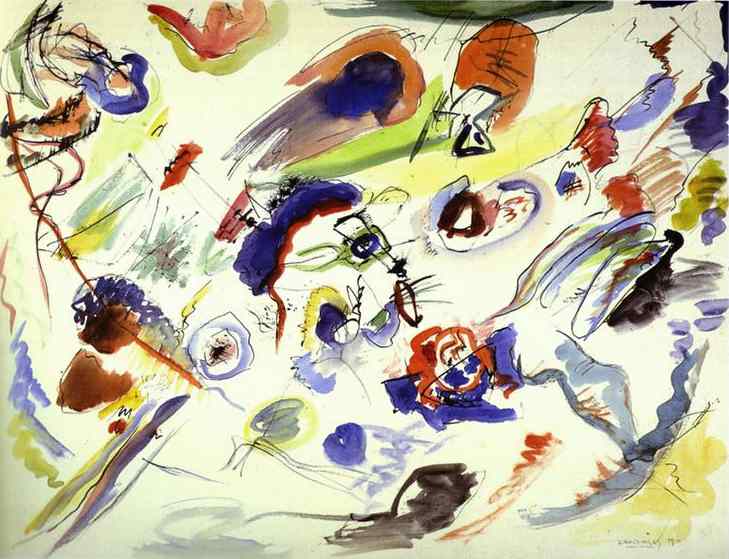
I would really like the spectators to go beyond the fact that I chose triangles and circles. I would like them to see what’s behind my paintings because that’s the only thing that interests me. I always viewed the problems of form as secondary… I know that the future belongs to abstract art and I’m dismayed when other abstract painters don’t go any further than form…First Abstract Watercolor by Wassily Kandinsky, 1910.
Other wings of abstract art starting with Malevich and the Constructivists will be more formalist, but we’ll have to jump a few years in order to arrive at Tim Gaze’s book 100 Scenes, a graphic novel. Before leaving Kandinsky, for now, I want to stress what’s in common between the two: they both had/have an interest in music (in Tim’s case it’s Dubstep). Following Lithuanian painter and musician Mikalojus Ciurlionis Kandinsky believed in a synesthetic relation between colors and sounds (1912):
Yellow is disquieting to the spectator, pricking him, revealing the nature of the power expressed in this color, which has an effect on our sensibilities at once impudent and importunate. This property of yellow affects us like the shrill sound of a trumpet played louder and louder, or the sound of a high pitched fanfare. Black has an inner sound of an eternal silence without future, without hope. Black is externally the most toneless color, against which all other colors sound stronger and more precise.
It’s easy to know where Tim Gaze is coming from because he tells us so in his Notes. He cites three main references: Andrei Molotiu’s abstract comics and “ground-breaking volume Abstract Comics: The Anthology (2009)[;]” Surrealist art and techniques (collage books and decalcomania paintings by Max Ernst); Henri Michaux’s Tachiste (Pierre Guéguen, 1954) sequential work. One may say that, briefly, Surrealists and Tachists (Informal Art, Art Autre – Art of Another Kind -, as Michel Tapié put it in 1951, 52) advocated a spontaneous, irrational, kind of art. Both groups were fascinated by drug use, magic, popular art and, sorry for using an expression that I don’t like much, outsider art (Jean Dubuffet’s Art Brut)… Informal artists are the European equivalent of the Abstract Expressionists in the U.S.A..
Tim Gaze says that his graphic novel “touches upon two emerging areas: abstract comics [...] and asemic writing.” I’m with Kandinsky when he said that “[t]here is no form, there is nothing in the world which says nothing.” Writing may be asemic as writing, but a sign is a visual entity signifying with visual means (as Tim put it: “[t]hese areas transcend languages, and offer the possibility of inter-cultural communication without words.” (Just like music, right?…) As Tim puts it, polysemy is high in his book:
This is an open novel, for you to project your mind into.
Every page is a stimulating field for your imagination.
So, there’s no predetermined meaning here, entropy is at its fullest, we have achieved maximum energy.
We may start with the cover of 100 Scenes above. I asked Tim if the book had anything to do with Katshushika Hokusai’s One hundred views of Mt. Fuji. He answered me that “only the title has any connotation of Hokusai.” So, false clue there, I would say… First of all: is this a novel as the cover claims? How can it be if there are no characters or plot? Isn’t the concept of “graphic novel” stretched to the breaking point? I would answer yes to the first question and no to the last one. We don’t even need to go further than the cover to understand these answers. There are at least two reasons to explain them:
(1) The cover of a book is what Kandinsky called, the basic plan. Without the title (without the words) the basic plan would be a square (as we can see above). So, it’s the book’s format that limits the basic plans’ choice.
(2) A drawing on a gallery wall (or a comics original panel) has a materiality (white pentimenti, irregular intensities of black, the paper texture, etc…) lacking here. What we have above is an image of an image of an image (a copy of a monoprint): i. e.: in McLuhan’s terms the hot drawing cooled down creating a distance that, in Benjaminian terms, provoked the loss of its aura. Hence: there’s a movement from the visual arts to literature: the graphic novel…
Having established that we may now answer the second question: the comics people co-opted the word “novel,” but graphic novels have their own specificity being nothing like novels.
The drawings in 100 Scenes result from various tensions, then (to use another Kandinskyan word): human made / machine reproduced; line / texture; black / white; positive space / negative space; centered / decentered; stillness (the basic plane) / movement (the drawings); chaos / order; regular rhythms / irregular shapes; etc… From page to page we witness a restless, lively world. It’s like a godless theogony (another tension?) in which trial and error coexist. I’m on the verge of denying the abstract nature of this graphic novel, so, I’ll stop now…

Page from 100 Scenes: the regular rhythm, the irregular shapes, in ascension.
I’ll finish with part of Henri Michaux’s postface to Movements, 1951:
Whoever, having perused my signs, is led by my example to create signs himself according to his being and his needs will, unless I am very much mistaken, discover a source of exhilaration, a release such as he has never known, a disencrustation, a new life open to him, a writing unhoped for, affording relief, in which he will be able at last to express himself far from words, words, the words of others.
Page from Movements by Henri Michaux, 1951.


A kick In The Eye: A Collaborative Graphic Novel. CreateSpace Independent Publishing Platform, 2013.
This is unlike a typical graphic novel or illustrated book, which relies on recognisable pictures and legible text. A Kick In The Eye is a multiple-authored graphic novel containing only abstract images and illegible asemic writing.
This project came about through the will of Tim Gaze, author of 100 Scenes, and a group of authors that come from visual poetry, experimental narrative, asemic writing, and other contiguous territories. Together, they created a small constellation that gave origin to this collective and collaborative “text”. The authors are, besides Gaze, Rosaire Appel, Tony Burhouse, Marco Giovenale, Gareth A Hopkins, Satu Kaikkonen, Gary J Shipley, Christopher Skinner, Lin Tarczynski, Orchid Tierney, Sergio Uzal and Nico Vassilakis (whom you should recognize as one of the co-editors of the excellent The Last Vispo Anthology).
To enclose the word text within inverted commas above does not mean we are denying A Kick in the Eye a certain solid structure, or even that it engages with the possibility of the mental process we call reading. But I did it in order to force us to be sure of what we mean by it. This book joins two distinct researches, relatively modern, and that have been met with good fortune in the past few years. On the one hand, we have asemic writing, on the other, abstract comics. To all effects, we can safely affirm that this book contains both images and text. But just as asemic writing can been shown next to iconic, concrete and recognizable images, and just as abstract images can be anchored by legible, interpretable words, according to any degree of simplicity and accessibility (and there are plenty of examples of either sort of “meetings” between them), what happens when we cross an illegible “verbal” matter, whose semiosis is not coherent at all and which has no code, with a “visual” matter that has no correspondence whatsoever with the things of the world?
But what do we mean by “images” and “text” and how can they be not only combined but merged?
Instead of thinking of images and text as two opposing semiotic systems, or at least with a quite divergent nature, we should consider them as living in a continuum, in accordance with lessons from Tim Gaze’s theoretical writings and his own artistic processes. Of course, in the first instance, even if we regularly forget about it, text is perceived first and foremost as an image. After all, we see letters before we read them, and before we learn how to write we learn how to draw letters (in both Portuguese and English, and other languages, we use this verb nonchalantly to describe the apprenticeship of writing). If we use certain theoretical and abstract tools, however, such as Peirce’s semiotics, we come to understand that there are degrees of difference in the interpretation of icons (usually images) and symbols (quite often letters) (we’re oversimplifying, of course, but let‘s keep it simple). In any case, under that light, we can think of some experiences in which image can be used with a textual value (from rebuses to the Lettristes, and the many projects that attempted to create an info graphics-based language, such as Isotype) or in which text is used for its visual value (from Hebrew micrography to Chinese calligraphic painting to Apollinaire’s calligrammes, from all visual poetry chapters to Futurism’s typographical interventions, and the projects of people such as Portuguese typographer/designer extraordinaire Paulo de Cantos or Massin’s Ionesco book). Many other examples could be called to the fore in order to constitute a free-range tradition of practices that converge on this notion that eliminates the perceptive, cognitive, and eventually, semiotic separation between writing and drawing. Once again with the caveat that, even if each and every one of the examples given is socially and culturally quite distinct from one another, that they have their very particular contexts that do not overlap and it is not possible to coordinate them in a neat progressive history (in the sense that one experience influenced the next), they still coordinate, to the extent that they share a will and an enthusiasm of bringing drawing and writing together in new ways, ways that mutually alter their very nature.
I am led to believe that “asemic”stands less for “having no meaning” than “not having socially accepted signs” (that is to say, that went through any kind of social, consensual assimilation process, or education process). A little detour is necessary here. If we draw on one lesson from Thomas Sebeok’s biosemiotics, we will find a grounding rule, or even an axiom, in these relationships: “no semiosis without interpretation”. According to Peirce, semiosis is the action of the sign, the process of the sign. There is a triadic relationship of cause-means-effect, or coding-vehicle-decoding, as for example (drawn from Gérard Deledalle) an army officer giving an order to his soldiers (event A) who interpret such an order (event B) so they can follow it (event C). For Peirce, the word “sign” did not mean simply something that is in the place of something else, for someone (this last bit is one of the fundamental differences from Saussure’s semiology). It could have two senses, depending if related to semiosis, which we just addressed, or if through the notion of the representamen. If we follow the definition found in the dignified Century Dictionary, a representamen is “an object serving to represent something to the mind”. The distinction can be quite complex, but Peirce himself provides an example that may make it clear as day: “In looking at a map, the map itself is the Vehicle, the country represented is the Natural Object, and the idea excited in the mind is the Interpretant”. Moreover, each of these terms, vehicle, natural object and interpretant can be seen as three “formal perspectives” of the representamen, which Peirce orders and explains as follows. The Vehicle is the first formal perspective on the representamen: it is the substance of representation; the Natural Object is the second perspective: the quasi-agent of representation; and the Interpretant is the third perspective: the quasi-patient of representation.
So perhaps what is at stake when looking at asemic writing or abstract images in general is that we realize perfectly that we do have a vehicle, in this case the book with its pages filled with “marks” (see below), and there can be no doubt that some ideas are excited in the mind… But what are its natural objects then?
Taking into account both meanings of sign in Peirce, then, how could we start describing these marks on paper? These “abstract comics”, these “asemic writings”, these “meaningless blots”? Do they or do they not have semantic content? Do they suggest some sort of meaning or not? Do they belong to any code or system socially accepted? A second batch of questions would ask in which genre(s) this book would be integrated, which UDC code would or could be attributed correctly to it, which disciplines should analyse it, which awards could it receive, which institutions should pay attention to it, and so on. No answer is simple.
Just like Abstract Comics: The Anthology, 100 Scenes, Ana Hatherly’s O Escritor, and other texts – whatever you decide to call them, and no matter what kind of integration you propose, whether in visual poetry or comics; I’m for ticking the “all of the above” box – A Kick in the Eye is a vehicle that triggers in our minds an idea. However, we are not able to find any consensual natural object for it. I may be terribly wrong here, but I wonder if we’re close to that which Kant called a “dynamic effect” in our search for the understanding of beauty, in his “floating image”: one in which we perceive an object but not its goal. These images imply a process of semiosis (they are cause, and provoke effects through the means of the pages), but it is as if its interpretability could not be shared in any common way. Provoking “any meaning” does not allow us however to reach “socially accepted signs”. Thus, they are asemic in that “open-ended” meaning proposed by the authors. Still, by looking at certain normalizing elements, such as framing, sequence, reshuffling of common elements, etc. perhaps we can think in terms of narrative, progress of action, communication, and so on.
So, the mixing of all these gestures in the same place – the page and the book – takes us back to the continuous spectrum in which we can find the poles of writing and image. The former can still be seen as a highly codified and stylised way of presenting signs that represent a closed number of elements (vocalic, consonantal and melodic sounds, etc.), but that can, in turn, be combined in an infinite number of representations, and the latter containing signs devoid of double articulation, that represent concrete objects – sometimes, they represent themselves – more or less close to the “real” objects that they represent (Peirce’s iconicity). As we’ve seen, such a neat division is troubled by both the consideration that we draw letters and see text, and more especially, by the com-plication (the hyphen in not a typo) of the relationships created in this book. We have a certain class of marks that seem to mimic the gestures one does when writing, but they do not produce any sort of code, regular patterns, even if highly designed or unbreakable. And another class of marks which are freer, larger, more instinctive perhaps, but which are not imitating anything in particular.
We have discussed elsewhere the several ways abstract comics can create both narrative sequences and freer forms of structured visual units, a proposAndrei Molotiu’s groundbreaking anthology (albeit in Portuguese). We also think that some of those strategies are used in A Kick in the Eye. And we believe that whoever comes across it will be willing to read it. In fact, experiences such as this book’s are not done in a void, nor is it done gratuitously, even though it may seem so to the uninitiated. But to pick this volume up, flip through it in haste and declare it “unreadable” not only is a disservice to the authors as it would be a failure in engaging with its structure.

Although appealing to authority is fallacious reasoning, I don’t believe it makes a weak argument to point out that these authors are people well-aware of a certain particular history – and a very much alive one! – of writing systems, of strange cases and detours, and non-decoded languages (from Linear A to the Voynich manuscript), of free calligraphy creations (from Zhang Xu to Michaux to Ana Hatherly), in a nutshell, of all the gestures that stitch back the profound and ancient graphic relationship – i.e., from “graphein”, Gr. for “mark” – between the creation of images and the creation of writing. That is a crucial part of A Kick in the Eye’s conditions of production: the authors search for the common, juxtaposed gestures that create that which seems, to our contemporary cultures (yes, I am assuming a mostly Western position, and I am not claiming its universality), separated. By combining a resonance that comes since our own pre-verbal times, whether from the point of view of civilization itself or from an individualistic, biological, human perspective, by a hypothetical amalgam of the acts of writing and image-making, by mixing what one does not know about writing systems of the past with what one does not know about writing systems of the future, and by forcing images to be associated to a continuity of a promising un-Form (a form before being formed, a form in flux, found in a background similar to Goethe’s Realm of the Mothers), A Kick in the Eye could well be a book that speaks to the back of our minds, more than to the illuminated, rational parts of out brains.
The project was created through an intense and intricate process of correspondence and exchange of materials between the authors, and in which the dialog is established within the pages themselves (allow us to simplify in that word, “page”, a complex unit of already complex “writing” and “image”), created throughout a certain period of time. These authors are not only different people, of course, but also creators that follow very different approaches, and techniques in their varied disciplines. Some of them use digital manipulation of images and writing, while others apply ink on paper with brushes; some of them experiment on various asemic writing styles while others are also more traditional poets; some of them have experience in creating experimental comics, while others are visual artists with more common curricula. So it comes as no surprise to find A Kick in the Eye a very differentiated thing within itself, which may lead to diverse reactions, page by page, from the same reader. Different dispositions, different engagements with each “unit/page” or even sequence, different intensities that will read each contribution in a specific, non-arbitrary but also non-equalizing manner.

Some of the pages, or at least some of its composing “material”, have been re-used by another artist in a new page. This process is notorious in many of the pages, but we will take as an example the spread that shows a Tim Gaze page on the left and a Sergio Uzal to the right. Was Gaze’s page used as a “background”, a “landscape” or as a “departure point”? Can we call it “diurnal” in opposition to Uzal’s “nocturnal”? Is it a “motif” (an Iberian mote) for Uzal’s “gloss” (the glosa)?

Given the fact that neither the images nor the writing present in this volume are identifiable in themselves, but the human brain insists in looking for patterns and meaning, and even recognizing where they’re not (see apophenia and pareidolia), our exposition to each and every page may lead us to fabricate complex processes of interpretation, even multiple, contradictory ones, that will never reach a solution, a final conclusion, but that will provides us with much pleasure nevertheless, precisely due to such a constant multiplicity. The fact that the authors use elements from their colleagues, or aim at some sort of variation on their own methods of creation reinforces such multiplicity. For instance, Lin Tarczynski seems to create a writing system that is physically similar to little pasta strands, with nervous curves, and their recurrence may make us find identical forms, internal rhythms, and “meanings”. As for Gary J. Shipley (one of his images is used on the cover of the book), he seems to use “dirtier” materials, perhaps graphite or some kind of inks, creating with them more organic, more “real” textures, emphasizing a material dimension that is not always present in the other authors (who “flatten out” their contributions). The way Shipley integrates elements from other artists as “frames” or “pieces” of his compositions, and the way that his gray textures seem to pop up here and there in the others’ pages – in any case, mimicking a process that guides the whole project – makes us think of a complex musical composition, perhaps a sort of visual motet, in which each voice remains distinct, using its own idiom and even “alphabet”, but that becomes more salient in one moment, and then later it underlines another form, and then falls into the background that upholds a different line of development, and so on. Even if reading allows us to pause in each page as much as we wish, and allows us to be as attentive as possible, it is also possible to flip through it in such a way, that each particular contribution becomes like Leibniz’“small perceptions”, unperceived in itself individually, but combining in an overall effect.

Some of the authors will use a sole, isolated asemic sign from another author. Others will employ a pattern of a colleague as a “texture”, or maybe as a “detail” in their new constructions. Some of them will trap in their own structures foreign elements, “protecting” them, as it were, from the adversity of other strange forms – why is it difficult, at least for me, to avoid biological metaphors when reading these projects? – while others isolate them, as if they wanted to emphasize them, cast a light upon them, and their potential meaning.
Actually, this process of isolating smaller, discernible elements, the choice of drawing up what may be called “frames”, and even “panel frames”, reminds one of normalised comics protocols. Actually, one of the authors, Lin Tarczynski, has an asemic comic strip, called Geranium Lake Properties, and she uses in this book, quite substantially, a sort of irregular orthogonality. Thierry Groensteen’s (and other semiotics-related scholars) lessons on the frame’s role – especially the fact that isolating a certain element turns that element into a discernable entity, and therefore potentially readable and interpretable – has a preponderant presence here, even if these structures are not always present or are not used in any systematic way. Besides, and even though A Kick in the Eye allows for a non-normalized, non-linear, non-protocol reading (we can open it at random, flip back and forth, or use the final index to follow each contributor individually), there are other subtle modes for the creation of reading “units”, “chapters” even, across the whole text. Orchid Tierney, for example, presents a final sequence, of black pages, in which a digital process seems to shatter and scatter light lines from circles, and in which the asemic writing of the other authors is, to a certain extent, “protected”. Found at the end of the book, it makes up a sort of progression that both reduces and “calms down” the “narrative”. It also makes us go back and attempt at finding other longer sequences or “arcs” within the whole book.
An ongoing, insistent, careful, melodic reading of A Kick in the Eye is mandatory. And such an effort will reward the readers in the blossoming, now subtle, now sudden, of any sense, which, even if not verbally transmissible, will be transmissible through, going back to its etymological root, an enthusiasm. - Pedro Moura


No comments:
Post a Comment
Note: Only a member of this blog may post a comment.